
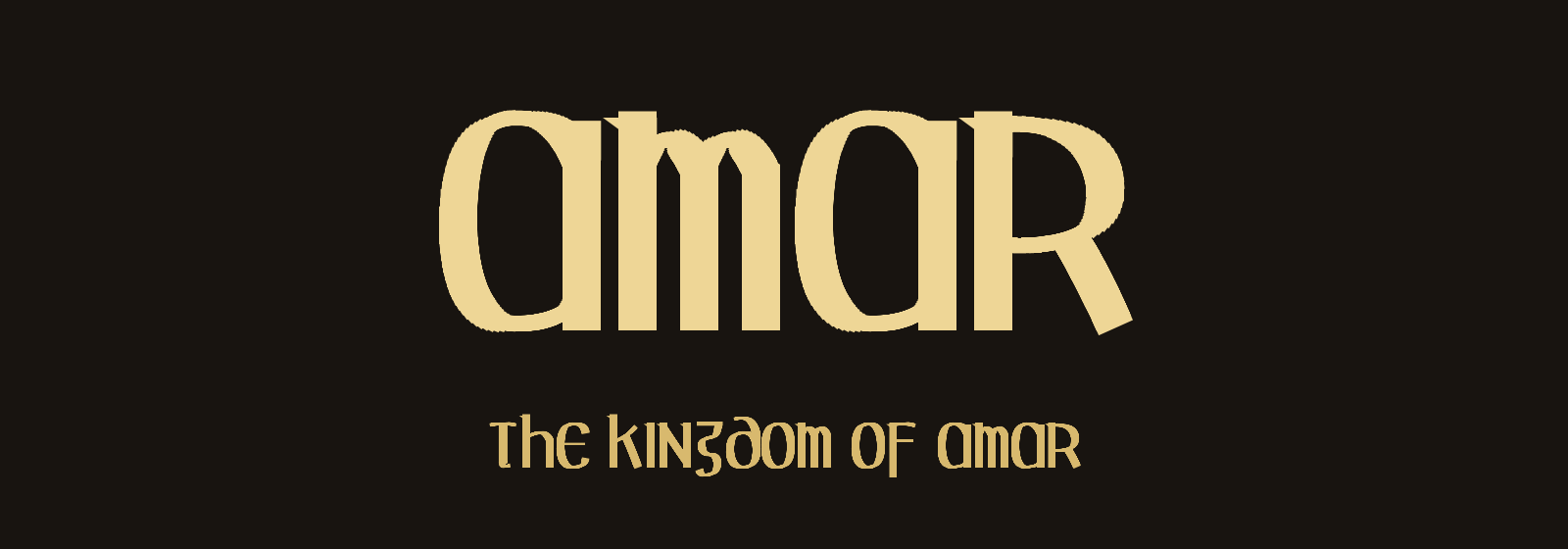
For a couple of years I have used one task as my litmus test for AI models: Create a fantasy font suitable for the Kingdom of Amar, my role-playing world. I want a TTF file I can install and write with. Every model has failed. Say hello to Fable.
Why is this hard? A font is pure geometry. The model must place every point of every letter by numbers, blind. It cannot look at what it draws. If the leg of the R lands wrong, the R is broken. And a font is a hundred glyphs that must also look like family.
Here is what Opus 4.7 delivered in December:
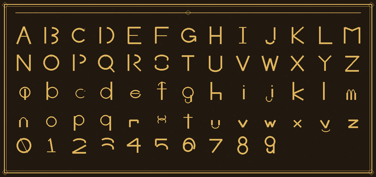
There is no font here. It painted a PICTURE of an alphabet and declared victory. The S is in two pieces, the small r lost its arm, the 3 and the 5 fell apart. Opus 4.8 was not much better.
Today I handed the same task to Claude Fable 5. It read up on the Amar world and picked a chisel-cut style, like letters carved in stone. Then he wrote a program that outputs a real TTF, rendered a specimen sheet, looked at his own work and fixed what he did not like. Then he installed the font on my machine and showed me this:
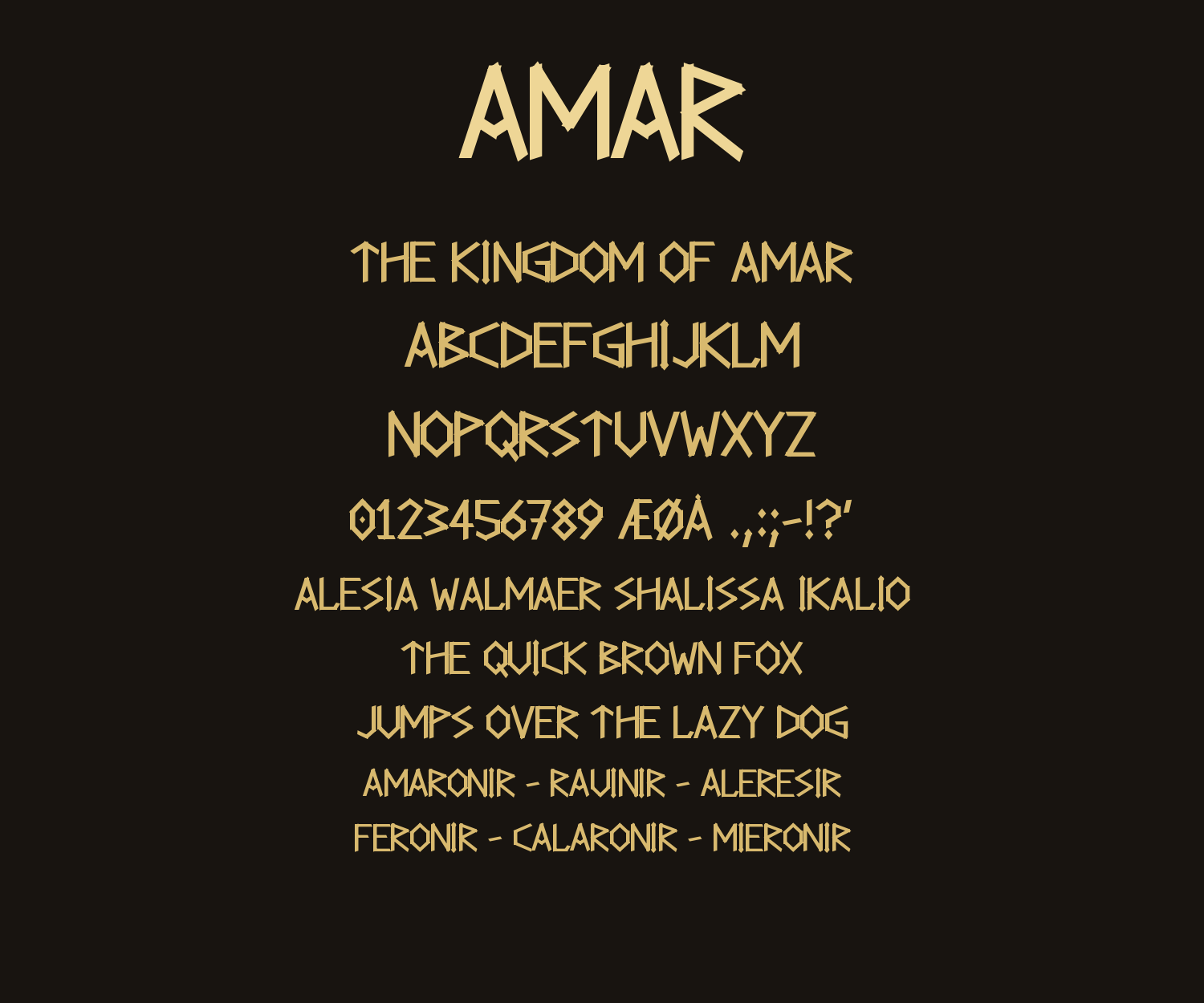
Runes with diamond accents. Every letter solid, consistent and readable. This is an actual font. But straight strokes are the easy part of type design, so I raised the bar: make me a more Celtic one, one that is even more suitable to the Kingdom of Amar.
Minutes later I had an uncial font in the style of the Book of Kells. Curved strokes drawn with a simulated broad-nib pen. Thick verticals, thin horizontals, wedge serifs. Even the old insular letterforms are there; the g is the flat-topped squiggle the monks actually wrote:
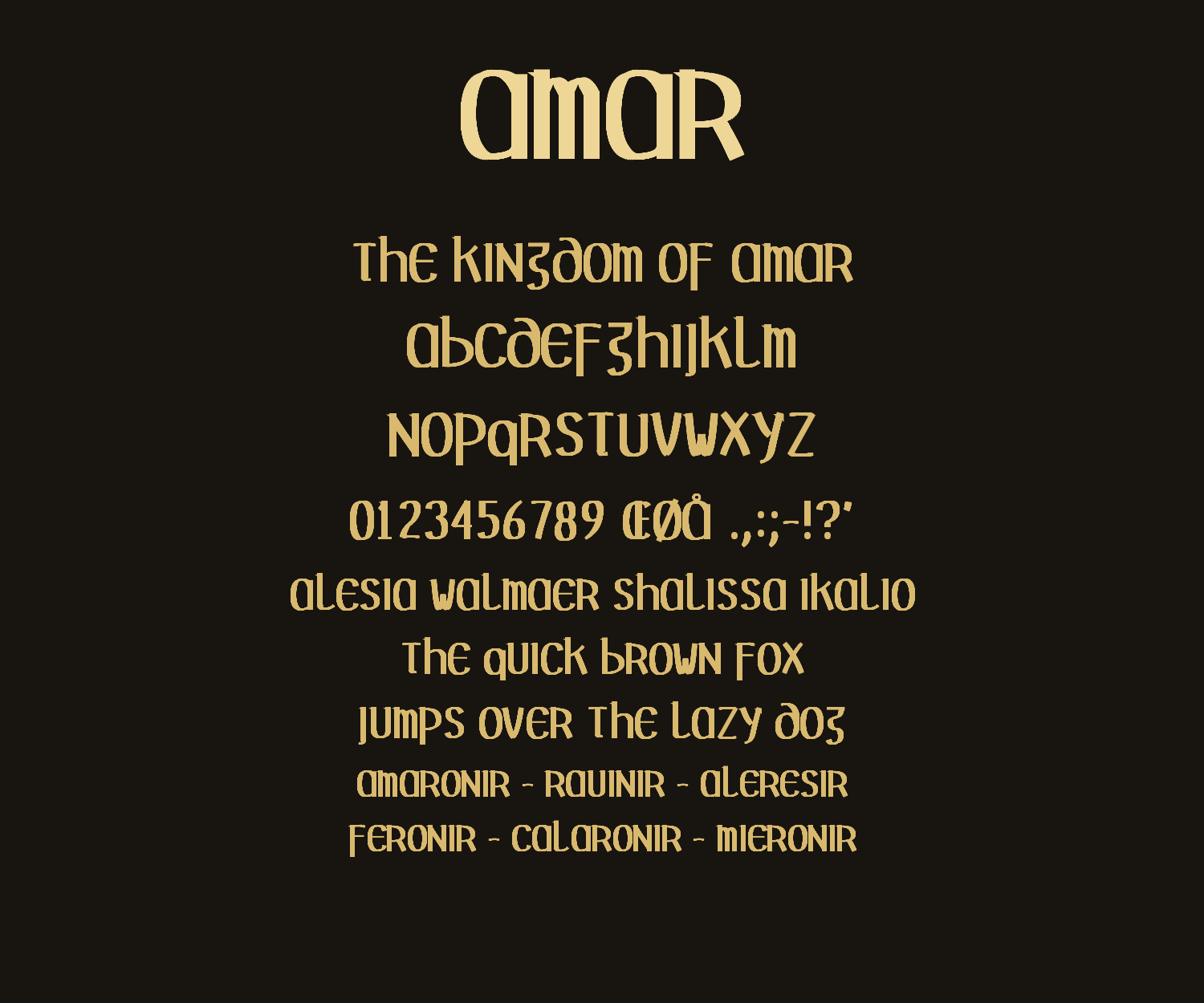
Both fonts are Public Domain, like everything I make. My litmus test finally has a passing grade. Now I need a new test.
Got any ideas?
Link to this post: https://isene.org/2026/07/A-Font-For-Amar.html